
NWSL Salaries
Short graphics story visualizing what the latest collective bargaining agreement means for NWSL player pay.


Punxsutawney Phil's predictions
Viz made with Datawrapper and Adobe illustrator exploring the accuracy of America's most famous groundhog meteorologist.

Clean electricity by state
Donut tile map created with D3 and Adobe Illustrator visualizing state electricity data.

2022 Spotify analysis
Analysis of personal Spotify data, examining top artists, songs, and genres.
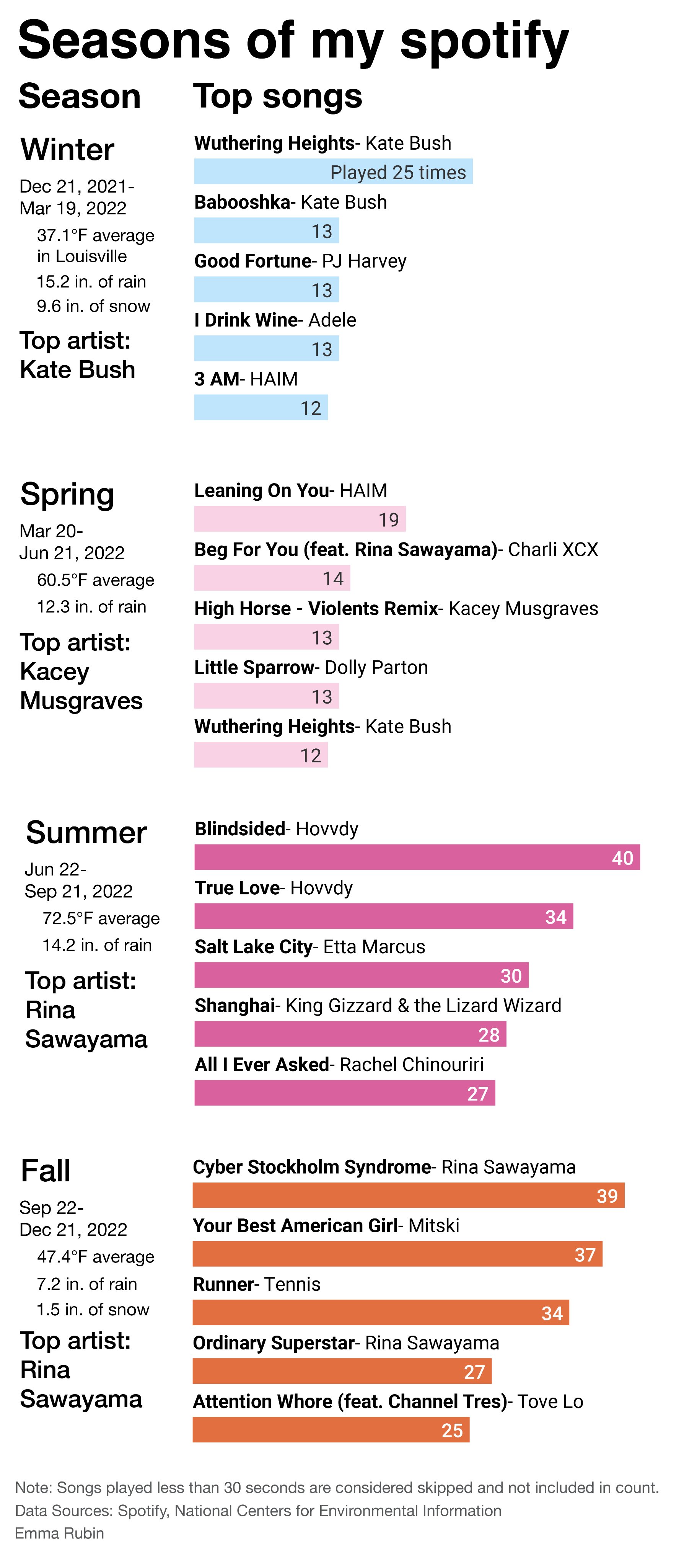
Seasons of my Spotify
Another analysis of (mostly) 2022 Spotify data. This time with a seasonal bent.